Products Center
>Road Machinery
- Anchor trolley
- Paver
- Road Roller
- Asphalt Mixing Plant
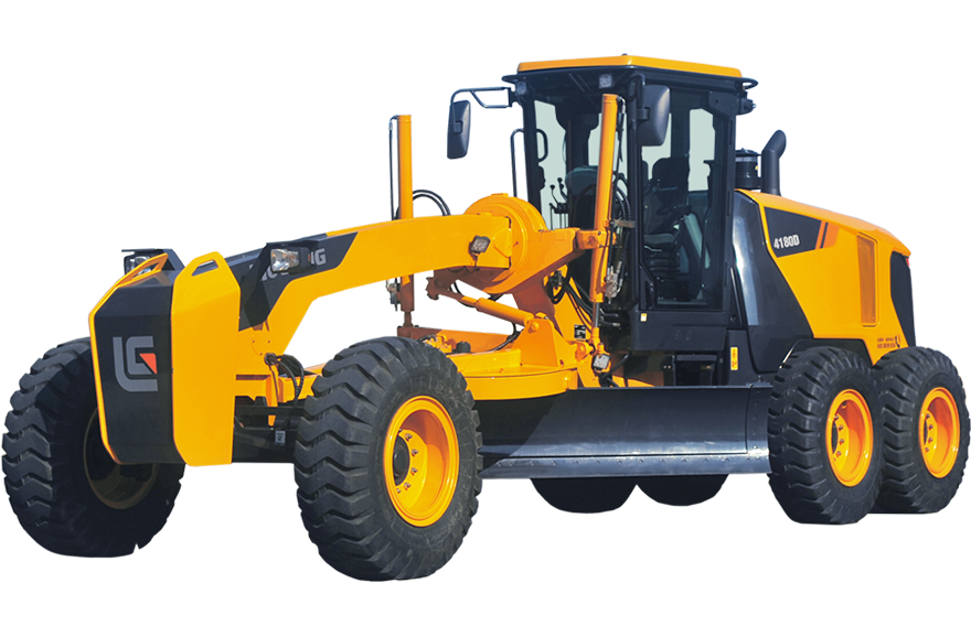
- Grader
- Compactor
- Plate Compactor
- Impact Rammer
- Burner
- Asphalt Mixer
- Roadheader
- Stabilizer
- Stabilized Soil Mixing Station
- Asphalt Emulsion Equipment
- Asphalt Heating Equipment
- Asphalt Transportation Equipment
- Asphalt Melting Equipment
- Asphalt Modified Equipment
- Asphalt Recycling Plant
- Material Transfer Vehicles
- Asphalt Brooms
- PowerFeeder
- Hot recycling equipment for asphalt mixture
- Shield Machine
- Asphalt Production Equipment
- Asphalt Storage Facility
>Concrete Machinery
- Concrete Spraying Equipment
- Truck-mounted Concrete Pump
- Trailer-Mounted Concrete Pump
- Concrete Pump
- Concrete Mixing Plant
- Concrete Mixer Truck
- Dry-mixed Mortar Equipment
- Bulk Cement Semi-trailer
- Carborne pump
- Mortar Truck
- Placing Booms
- Concrete Mixers
- Concrete Accessory Equipment
- Cement Tank
- Pavement Maintenance Equipment
- Batching Plant
- Recycled Material Processing Equipment
- Crushing&Screening Equipment
- Shotcrete Truck
>Piling Machinery
- Multifunctional drilling rig
- Double Wheel Milling
- Rotary Drilling Rig
- Horizontal Directional Drilling Rig
- Diaphragm Walling Grabs
- Pile Driver
- DTH Drill
- Continuous Wall Drill
- Auger Drill Rig
- Anchor Drilling Rig
- Full Casing Rig
- Pile Breaker
- Electro-hydraulic Pile Driving Rig
- Pile Frame
- Crawler Drills
- Punching Rig
- Cutting Drill Rig
- Reverse Circulation Drilling Rig
- Microdrilling
- Pile Hammer
- Hydraulic Grab
>Mining Machinery
More Products
- Skimming Machine
- Rock Drills
- Crusher
- Sieving Machine
- Mobile crushing station
- Screening And Crushing
- Sandmaking machine
- Boring Machine
- Slurry Equipment
- Beneficiation Equipment
- Grinding equipment
- Sand Washer
- Mining Truck
- Material Handling
- Processing Equipment
- Underground Loaders And Trucks
- Surface Drill Rigs
- Underground Drill Rigs
- Surface Miner
- Rope Shovels
- Air Compressor
- Diesel Generator
- Underground - Longwall